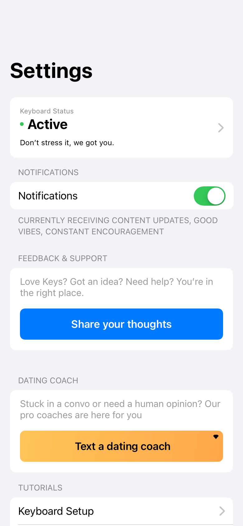
The Keyboard
a unique challenge
Space was by far the greatest limiting factor when building Keys.
What is Keys?
In short, it's the first of its kind - placing all the power of generative AI in a keyboard interface in order to allow users to access it wherever they're writing. To provide some structure, we focused on dating apps. They were a perfect combination of high-stakes conversations and clear outcomes, and gave us a clear vertical to pursue and build for.
Pills
Pills
These buttons are the most basic entry into Keys and AI text generation
Long story short, dating apps are busted
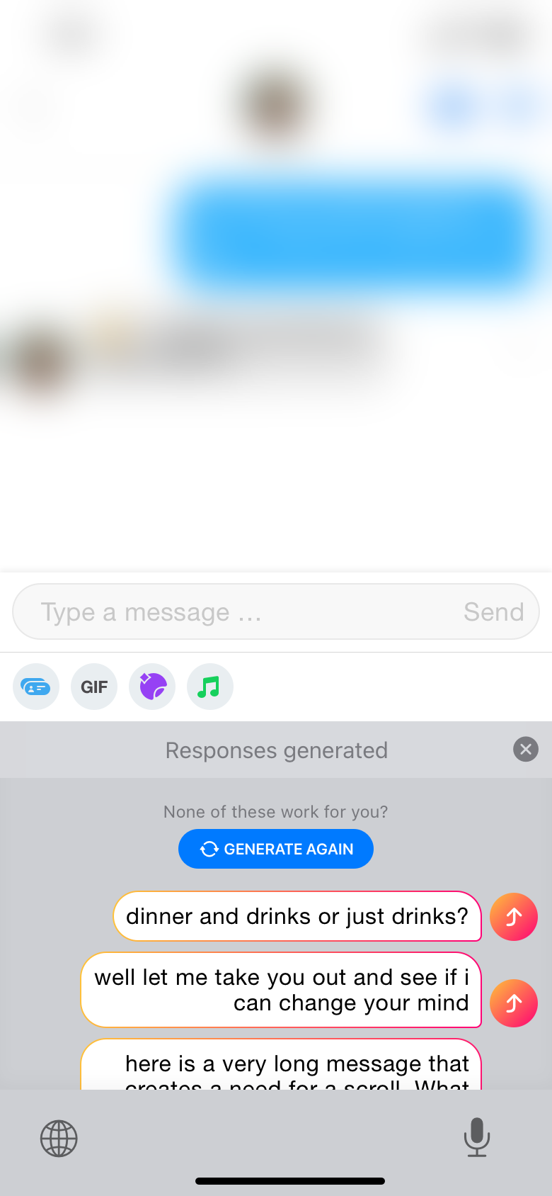
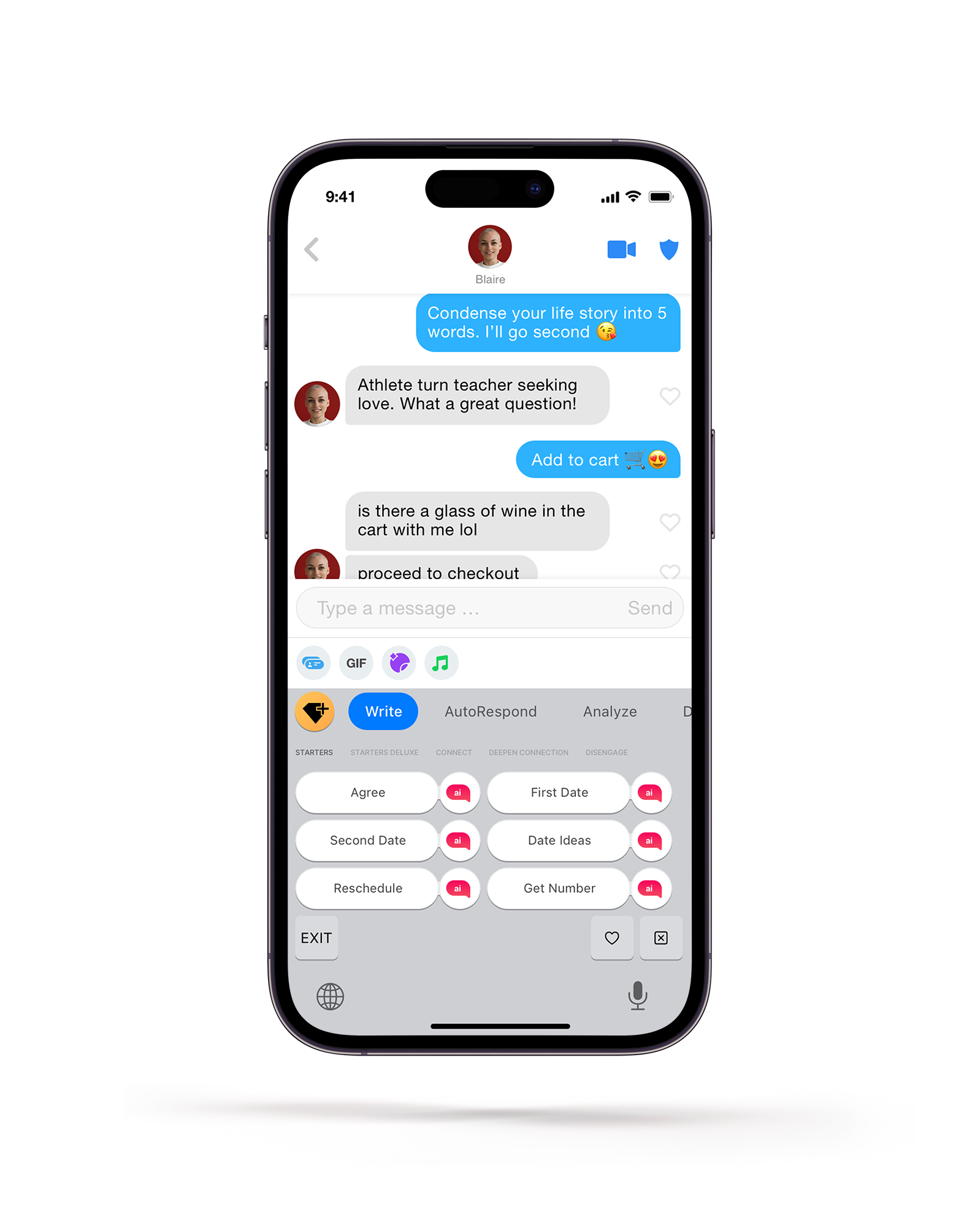
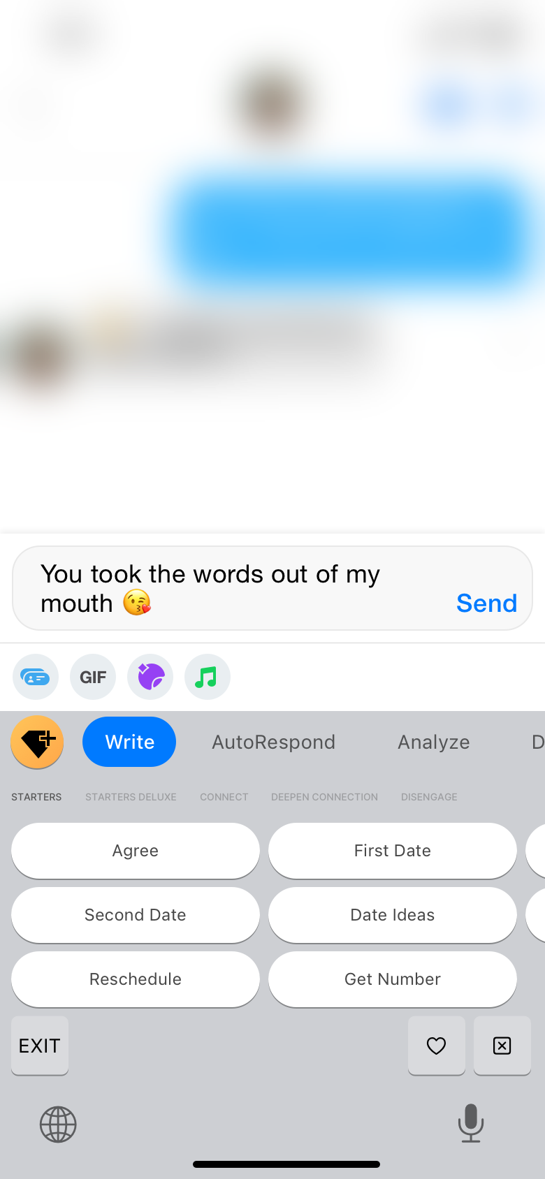
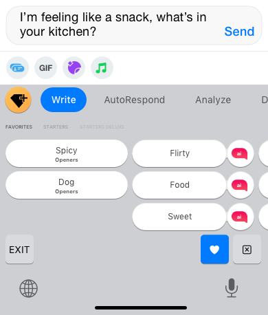
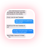
Pills were the first ui in Keys and to this day, they are also the most used. According to our surveys, the most difficult part of online dating is starting the conversation. However, due to the sheer quantity of interactions people have on dating apps, the quality of the openers is terrible simply because it's very difficult to put effort into starting a conversation 50 times per day, resulting in a lot of "hey"s.
We found that once two people start talking, they're largely able to keep a conversation going. Also, because online dating conversations tend to follow a pattern, we were able to provide content and help where users needed it most, typically at conversion points such as planning a first date or getting a match's number.
But why does it look like Apple??
I made the decision to retain Apple's design system because generally, I try to introduce as few new things as possible to users simultaneously. Additionally, I wanted to leverage the goodwill users have with Apple to help them trust our product.

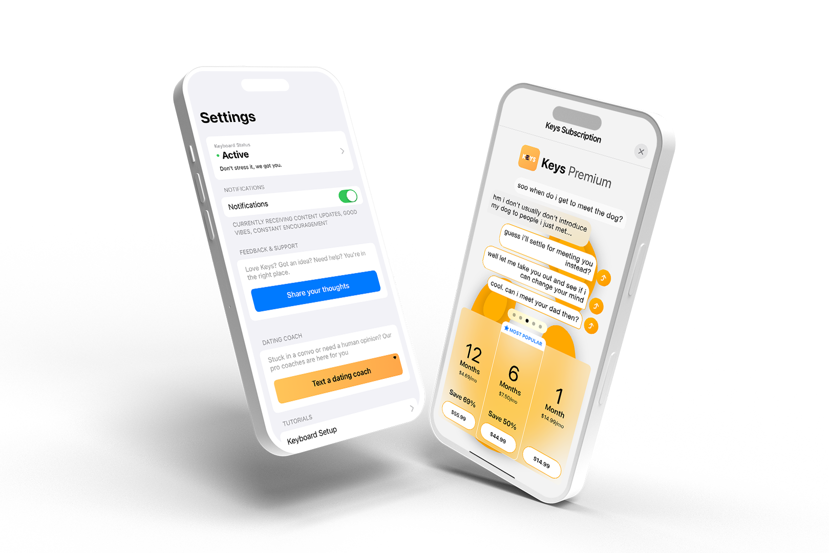
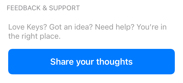
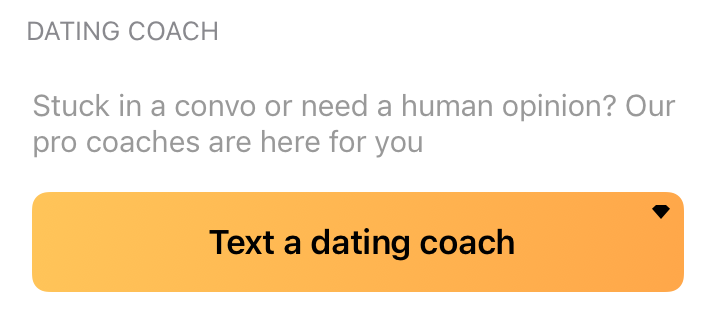
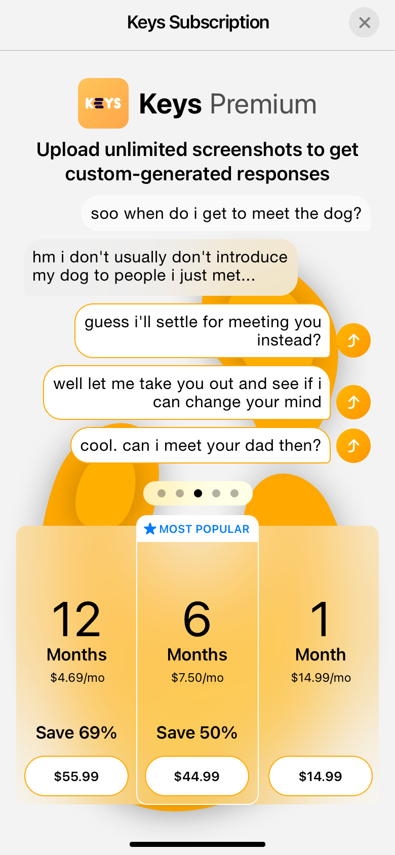
Features
These are the all the tools available to a Keys user, plus the option on the left to convert to a paid plan.

Categories
High-level categories that group all the pills, organized (loosely) by intent.

Keys
These are the bread and butter of the app, and to this day are the most used feature in Keys by a landslide. This version splits the functionality of the key, with the original, human generated phrases in a list on the left and brand-new AI-generated phrases on the right.
What if a user likes something the AI creates?
We implemented a system for "Savorites" (we could never decide whether to call it Saved or Favorites), which allowed the user to like interesting phrases, creating a duplicate of the pill the phrase came from, so that they could access that phrase at any time.
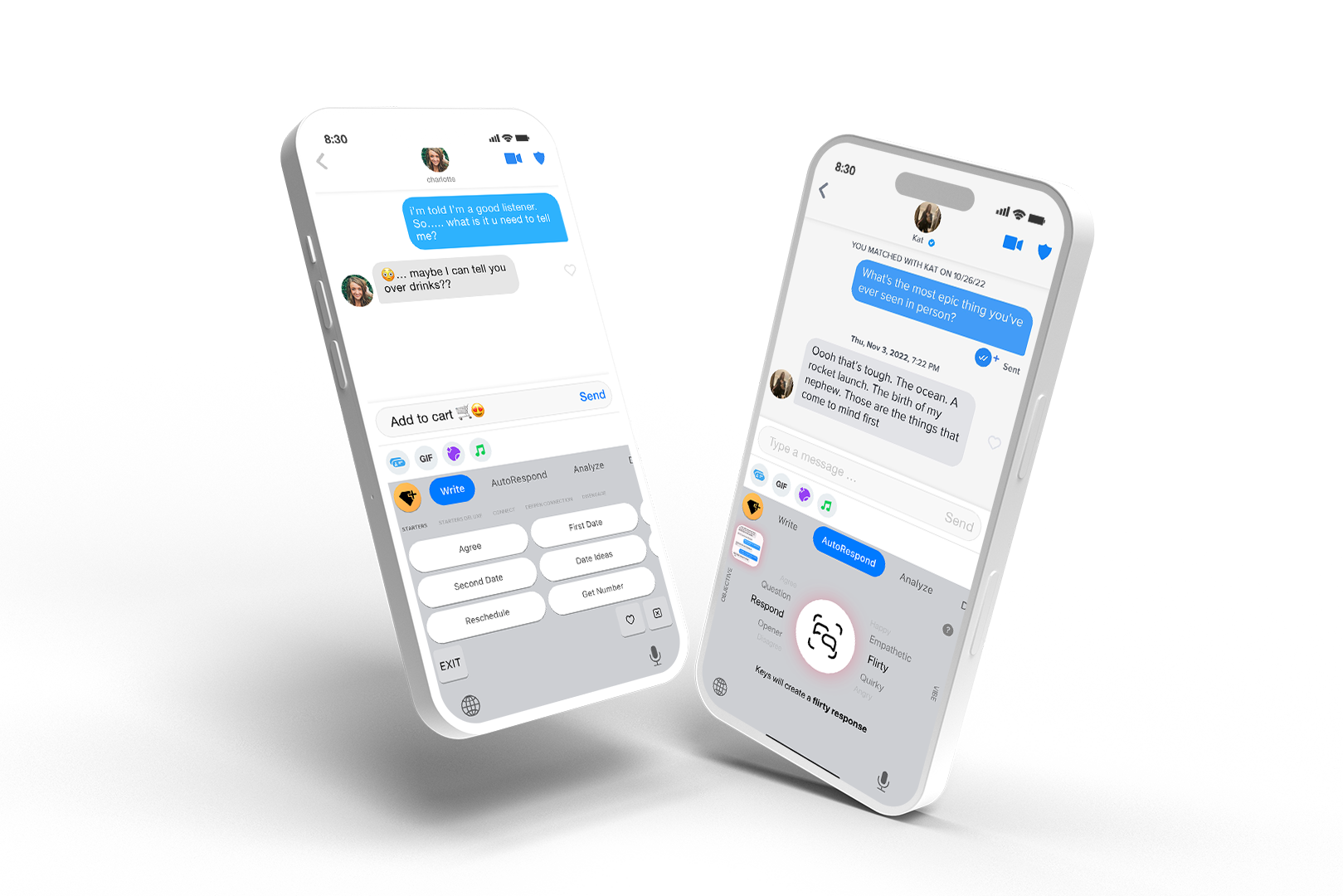
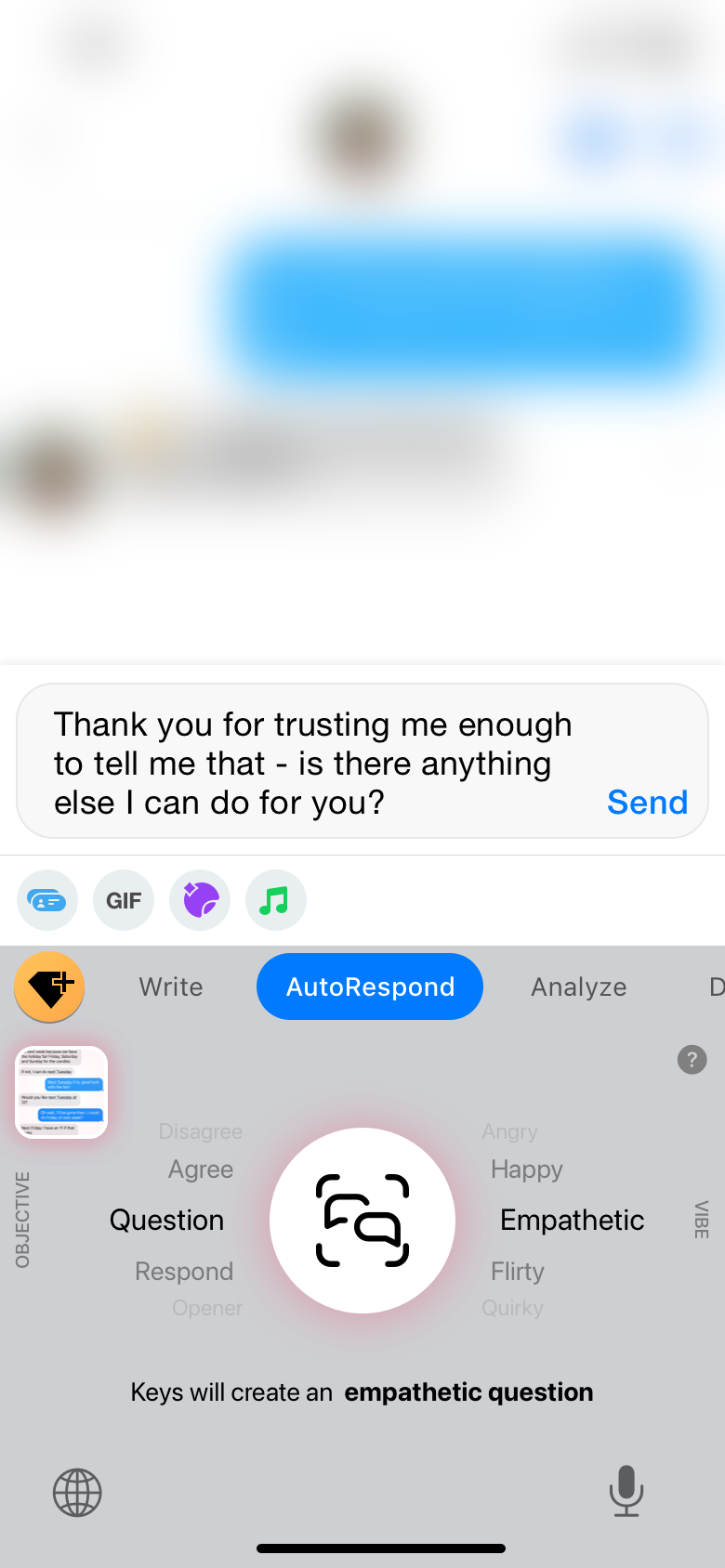
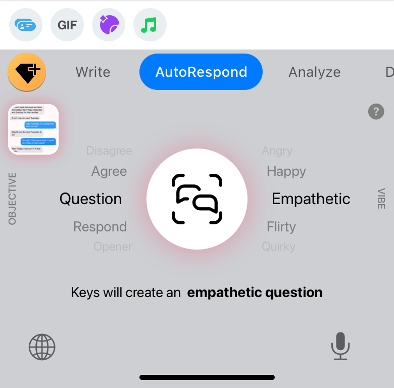
AutoRespond
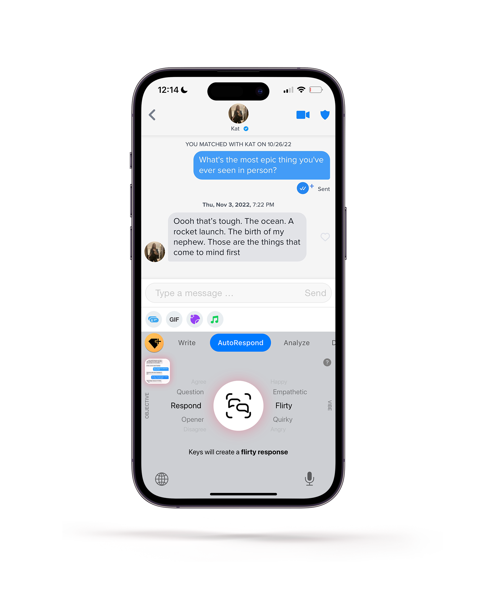
Autorespond
Someday, our keyboards will look more like this - less writing, more creating and tuning
Reimagining what a keyboard can be
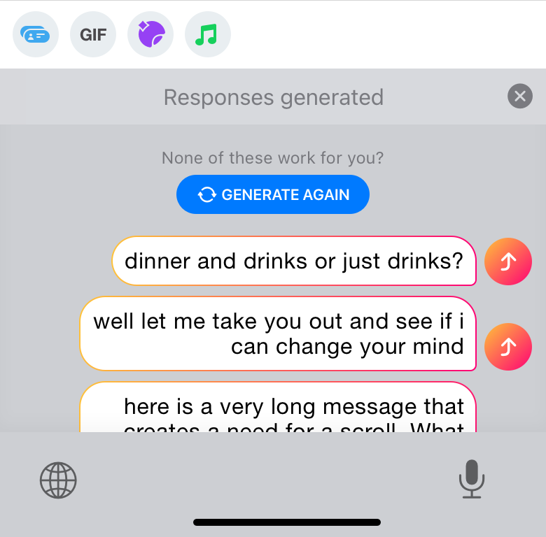
Within a year of working on Keys, I had a thought - what if all the texting you ever wanted to do could be accomplished with one single button? AutoRespond was the first step in that direction, utilizing a very clunky user experience to parse screenshots of conversations and return contextual openers and replies.
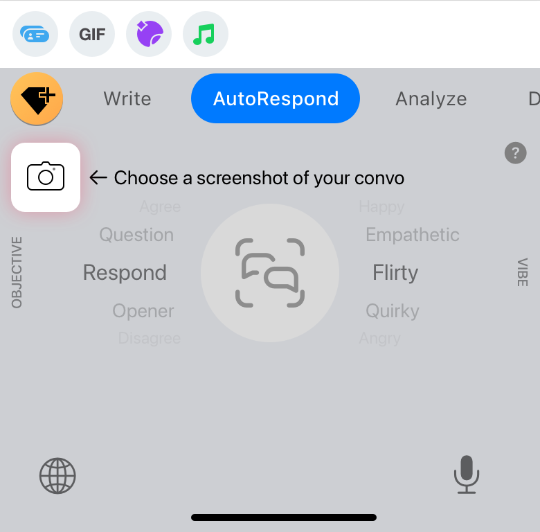
Screenshot picker
This little guy opens the native apple image picker. The screenshot flow is a fairly clunky workaround, but without system-level access to the conversation, this was the best way for us to get chat context.

Big button - now with dials ✨
After an initial release of the button by itself, we opted to give users more control of the AI output, allowing them to tune the phrases before they're generated.
Is this the future? No, but it's on the right track
I firmly believe digital keyboards as they exist right now will become secondary to some kind of generative AI solution. That's why we patented this before Google, Apple, and Samsung 😇
1
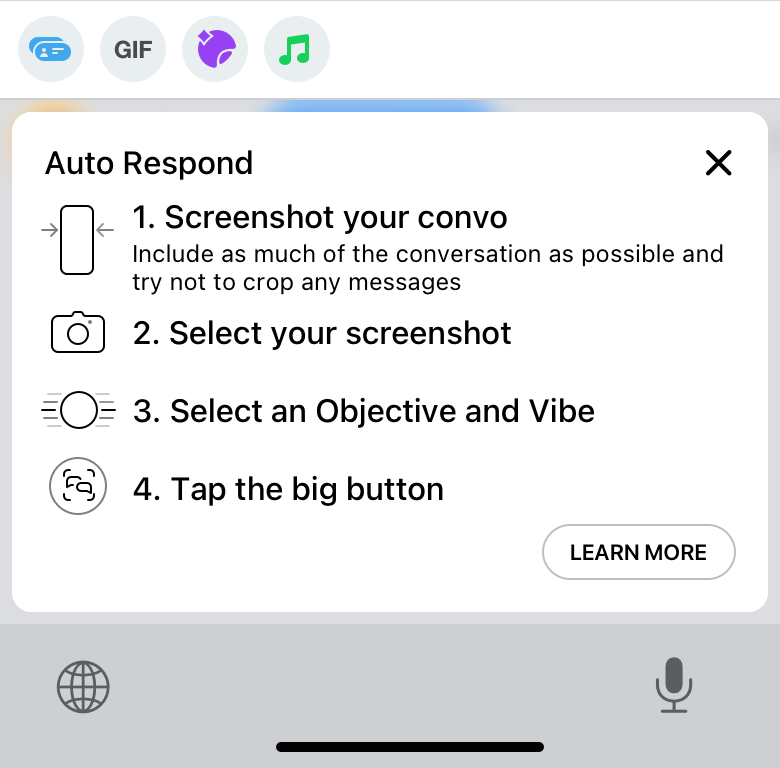
Quick Tutorial
Explaining all of the things we built was more difficult than any other design challenge. Limited space and a convoluted user experience were not our friends.
2
Select screenshot
The AutoRespond panel is completely disabled before a screenshot is selected.
3
Fiddle with the dials
Forcing the user to choose a screenshot before this step allows us to parse all the text and send it to our server while the user is occupied, making the time to completion feel shorter than it would otherwise.
4
Choose a phrase or run it back
Tapping the arrow to the right of the text bubble sends it to the textbox to be sent as is, or the user can switch back to a regular keyboard and make further edits.
Analysis
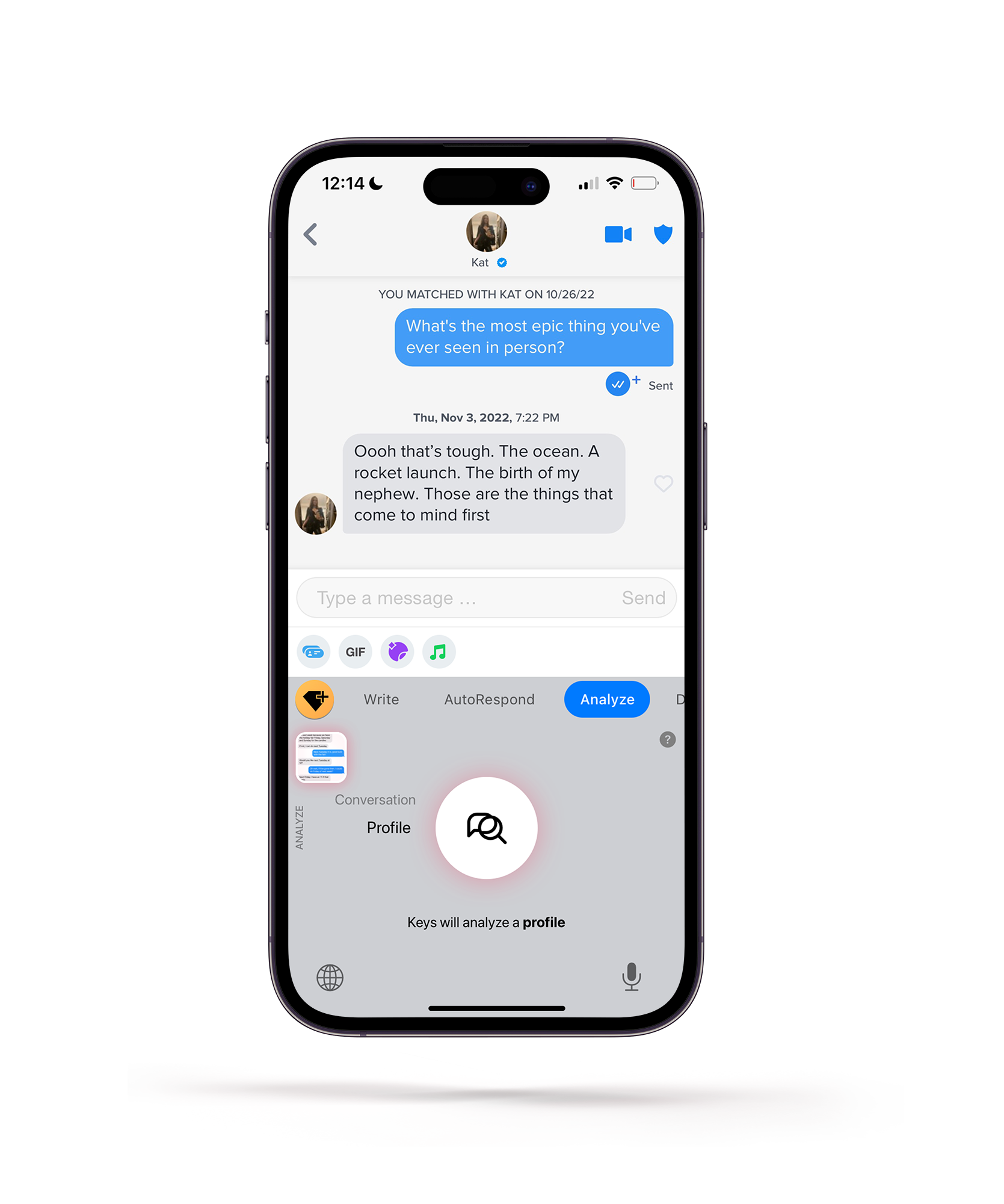
Like autorespond
...but with a little more to say. Keys has the validation you need.
Reimagining what a keyboard can be EVEN HARDER THAN I DID LAST TIME
After seeing how people were using AutoRespond, we began to consider Keys' role in people's lives. We decided to try to lean into being a trusted source of information, something that people could turn to, not just for things to say, but also for validation.
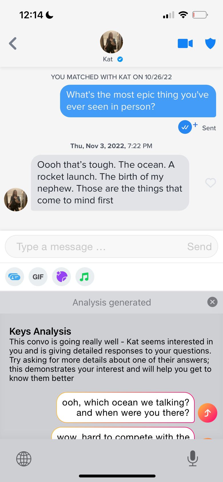
Analyze is basically a juiced-up AutoRespond
We found that many of our users weren't just looking for something to say, they were looking for the RIGHT thing. As we all know, there's almost never one perfect thing to say, but that doesn't mean we couldn't give our users the sense that they're making an informed and intelligent choice. By providing some context around the phrases that we returned to the user, we were able to offer some validation about what they were sending, as well as build a little more trust in Keys as a resource.