The Keyboard
wow
This thing is HOT. Impractical and annoying to implement, but really pretty.
Why neuomorphic?
Simply put, I think it's cool. But it also serves my broader vision for this product: I wanted Keys to feel infinitely adaptable. In some ways, this UI is an evolution of the animations I did on the Keys website homepage. It's fluid and changing and alive.
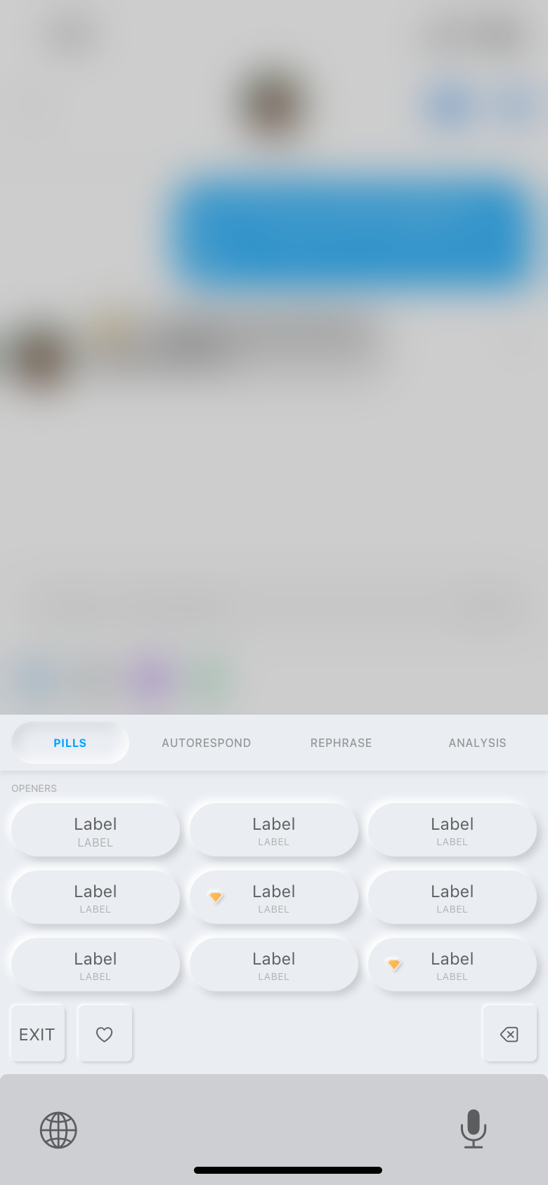
Pills
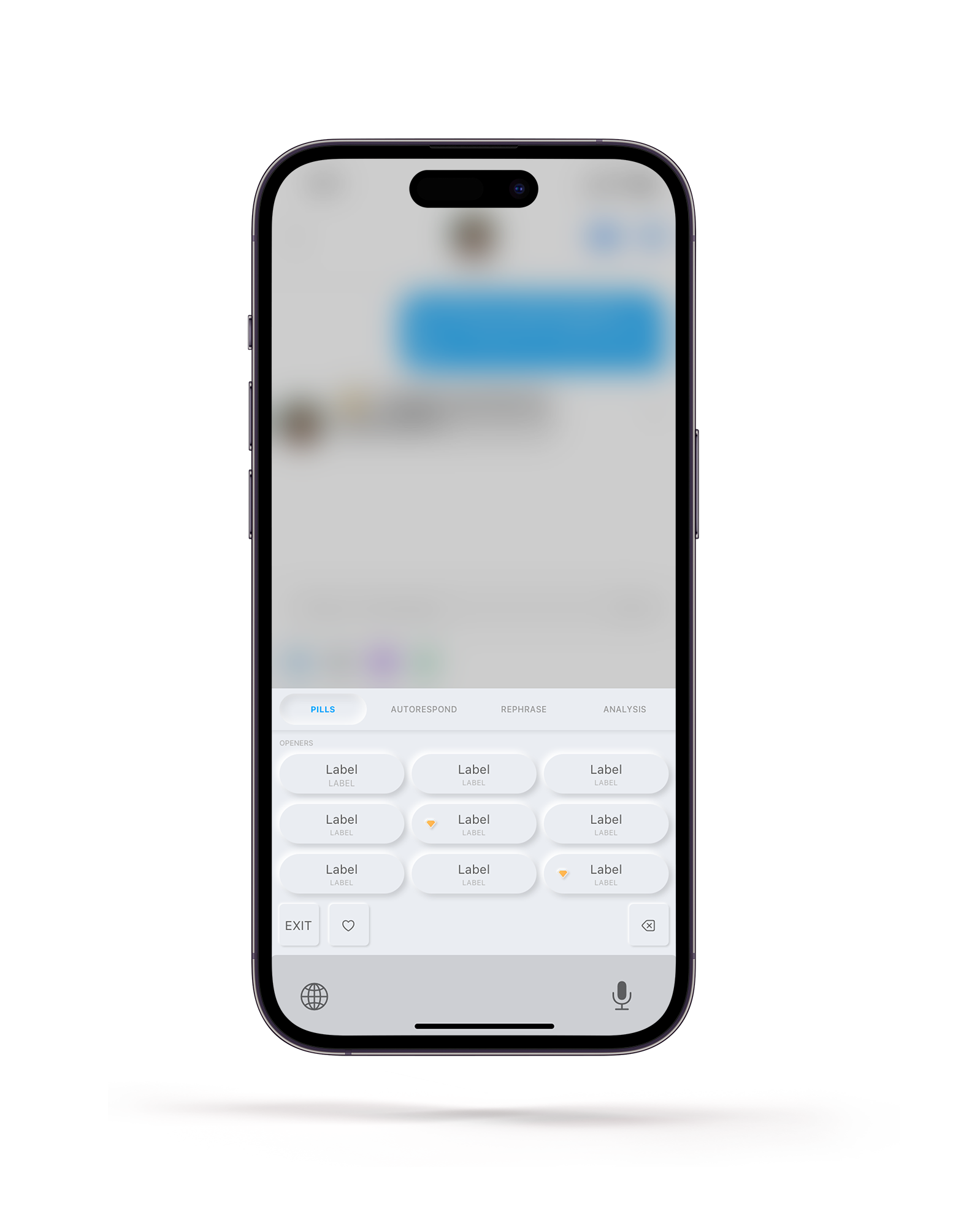
Pills
This is the view most similar to the original Keys UI
One of my favorite things about neuomorphism is how much I WANT to touch it. By showing that an element can be touched, it creates a curiosity in the mind of the user that can only be satisfied by interacting with it.
I love UI animations.
Part of exploring this style, aside from wanting to set ourselves apart from Apple, was to dive into a custom animation system. Because my vision for Keys was for it to feel like something adapting and changing to meet the user's needs, every element needed a build-in and build-out state, as well as toggles. Changing views in the keyboard would no longer be a hard transition; each element would build out to allow new ones to build in.
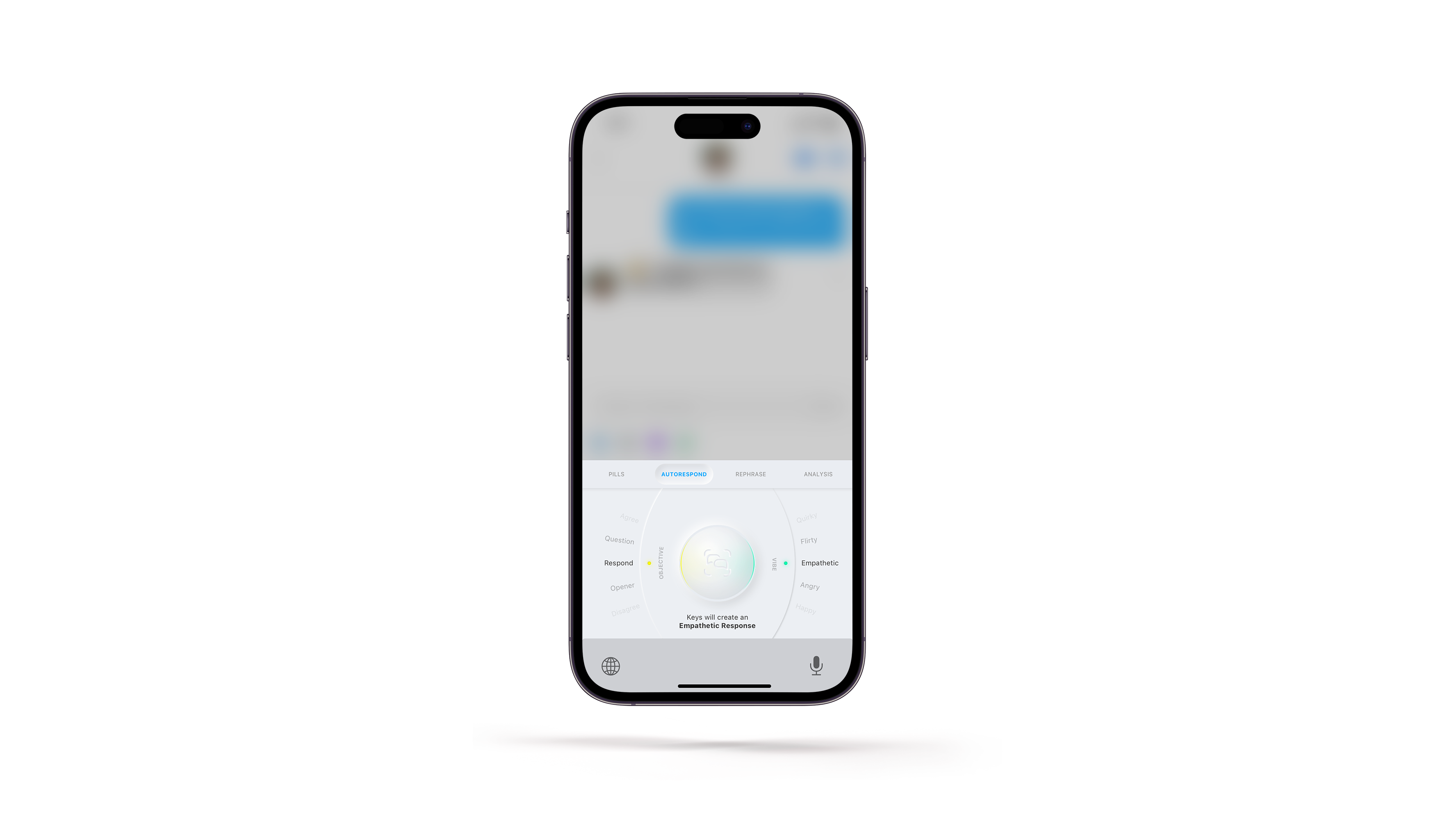
AutoRespond
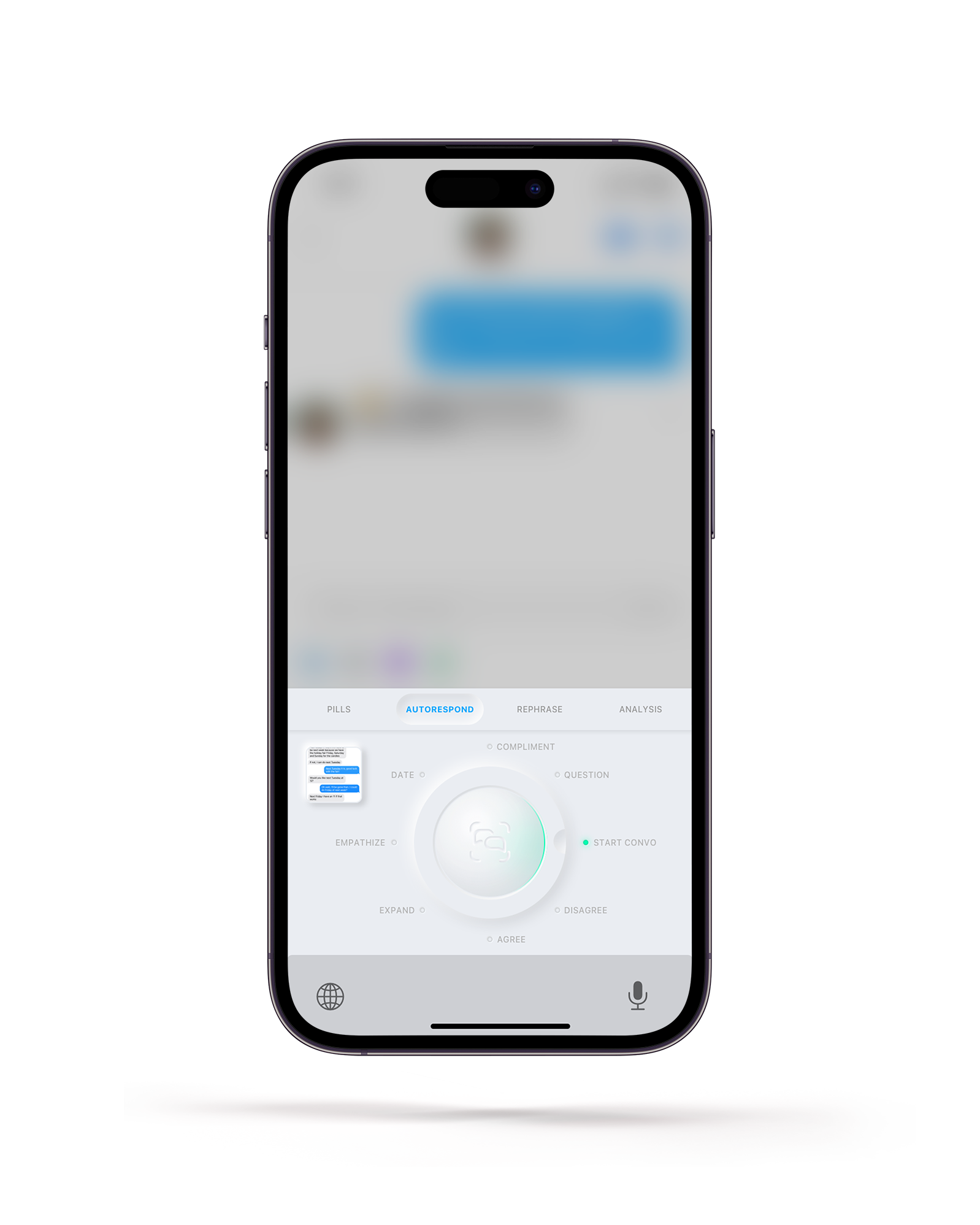
Autorespond
This dial actually prompted the inclusion of dials in the official Keys product.
The switch to neuomorphic UI is what originally gave me license to start breaking functionality into separate tabs within the keyboard. From there, my vision for one big button started to become more of a reality, and while we never implemented this style, the UX was directly lifted from here and led to the overhaul of the UX of the official Keys product.
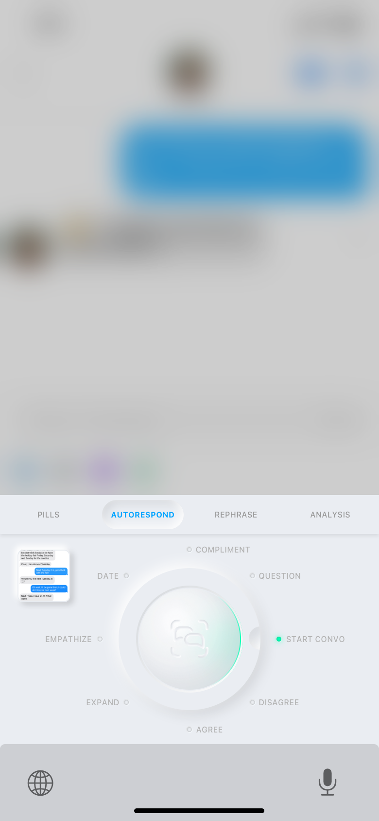
I wanted each option to feel like it has an identity that informed the final output
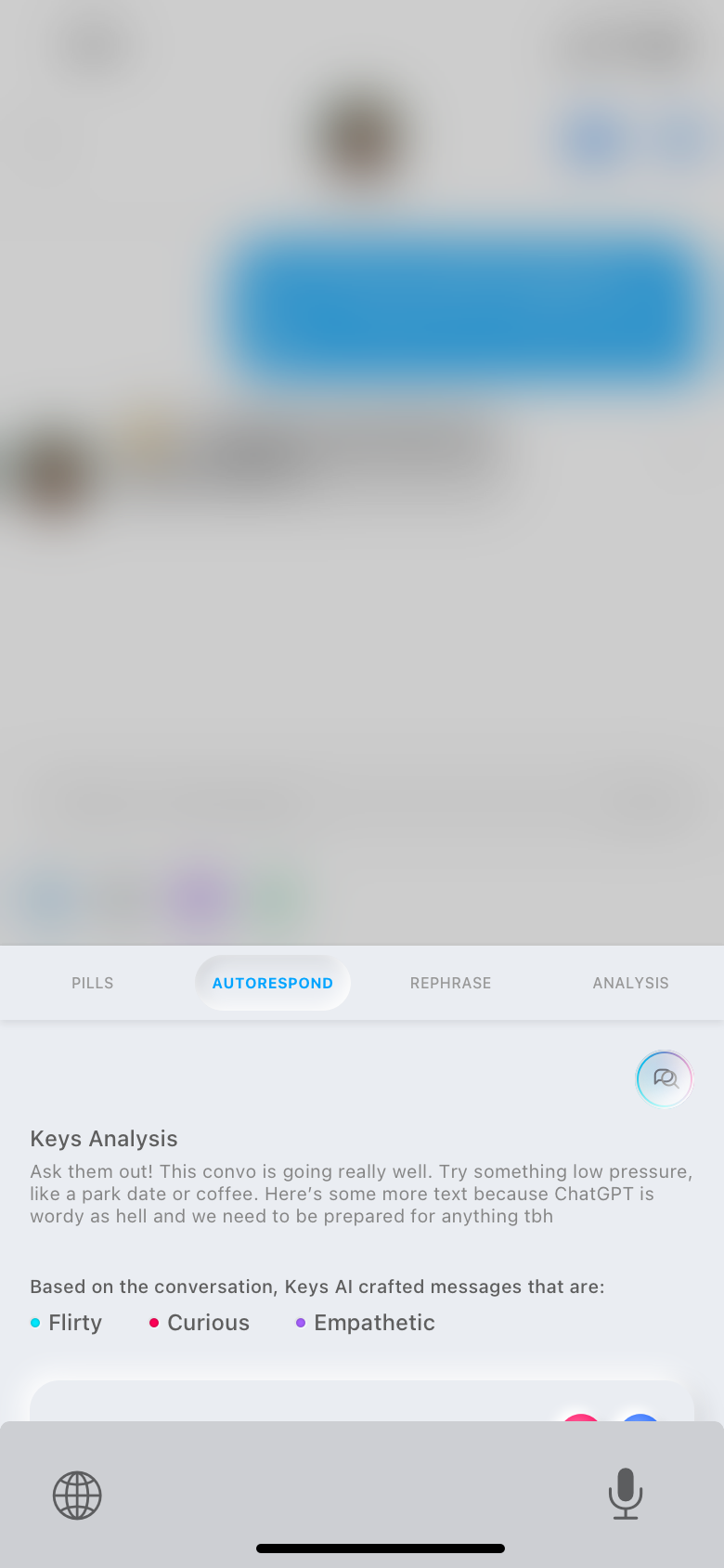
Analysis

Analysis
In this iteration, Analysis was built into the flow for AutoRespond
Analyze as an additional (and optional) part of the AutoRespond flow makes a lot of sense. The only thing it doesn't allow is the analysis of a dating app profile, which we decided was an interesting enough feature to build into its own tab in addition.
Some more thoughts about this thing
Another interesting addition to this version of selected phrases was the option to tap the button that looks like a little fork, which would save that phrase, delete the other two, and generate two new phrases based on the original. This would allow iteration of a phrase while holding the info from the screenshot without having to re-upload or provide additional input.
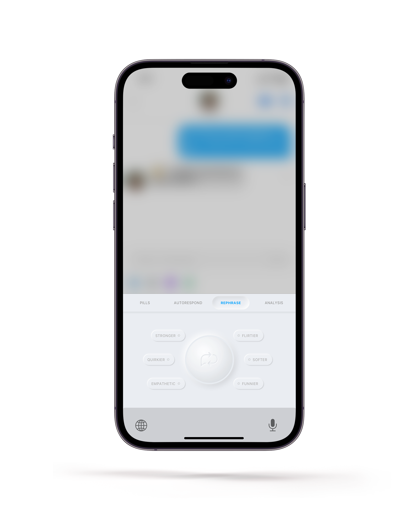
Rephrase
i forgot we built this!
This was another tool meant to allow the user some degree of iteration for phrases
Rephrase takes the text in the textbox and allows the user to add inflections to tune it without losing the original meaning or intent of the phrase.
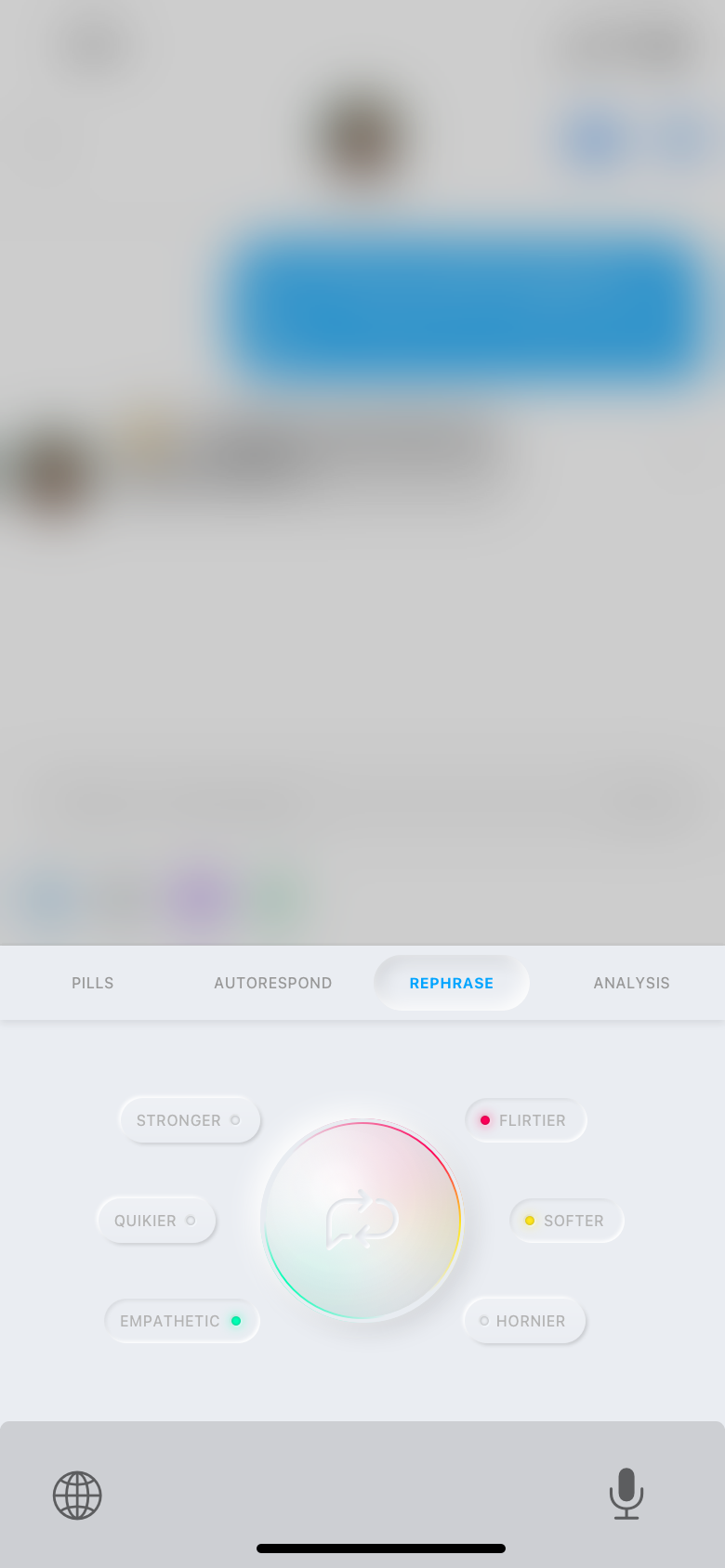
I loved the idea of combining different tones to make something sound exactly how you want it to.